


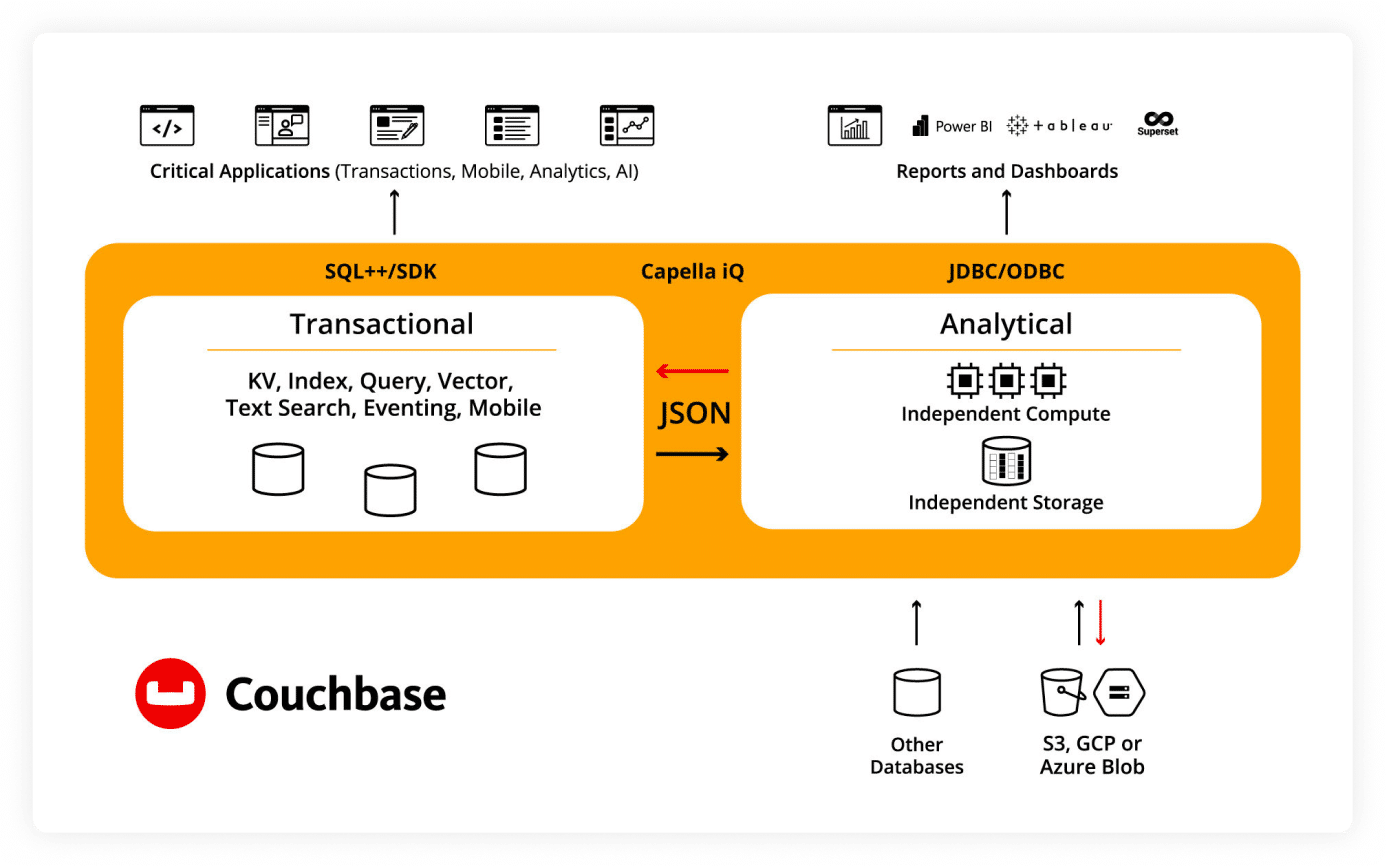
JSON-native

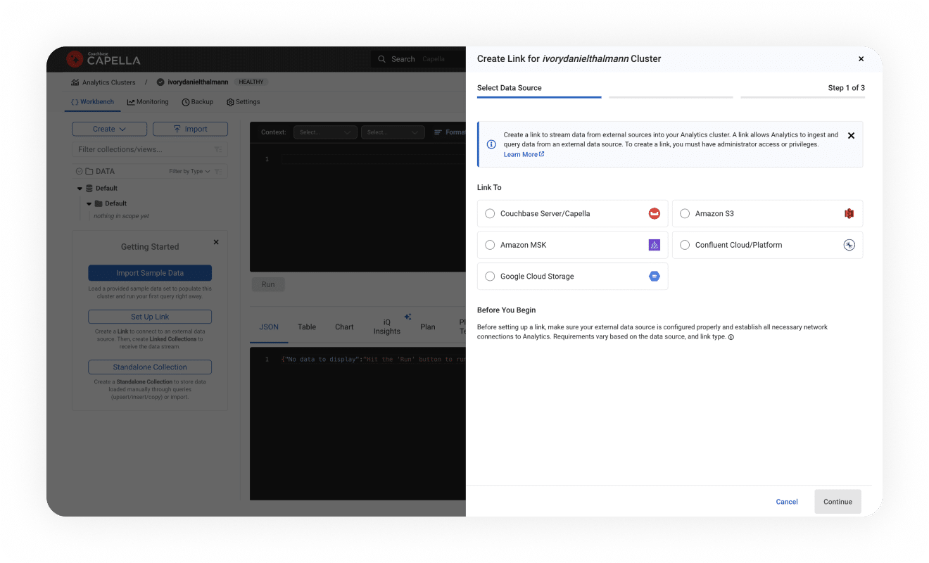
Unified ingestion

Developer independence

Better applications

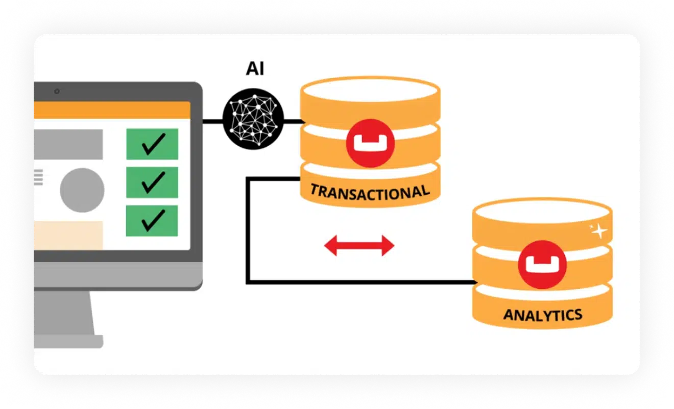
Operational and analytical data
Zero ETL for JSON
Multi-source ingestion

Offline feature store
Conversational analytics

Operational write-back

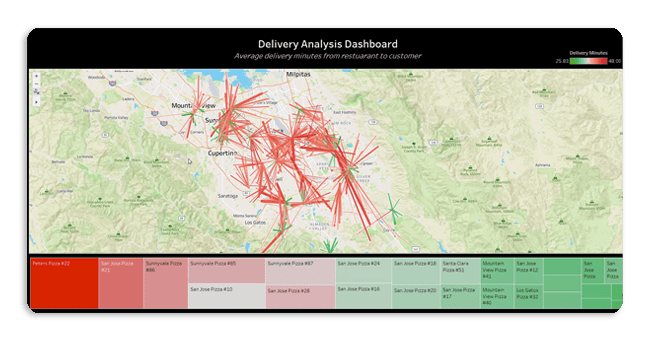
Lightning-fast analytics

Compute and storage separation
Easy access
Single UI and security
Real-time analysis of JSON data
Zero ETL means teams can make informed decisions faster, reacting swiftly to application changes and reducing risk. SQL++ based JSON querying solves the challenges teams have with analytics in relational database management systems.
More control and independence
Developers perform ad hoc analysis faster without needing to define schema and in a conversational manner with Capella iQ.

Build critical applications
Utilize real-time metrics to drive action, improve applications, and enhance user experiences.
Single JSON-native platform
The only JSON-native data platform for both operations and real-time analytics services. Build robust apps faster, while saving time and costs.
What customers are saying

“Couchbase gives us the best of all worlds when it comes to managing customer marketing data.”

“Couchbase is a trifecta of value. We get more features, save time, and spend less money all at once.”

“To set up a resilient implementation of Couchbase, it took us minutes. We stood up three servers, balanced the load, and instantly we were resilient.”


Start building
Check out our developer portal to explore NoSQL, browse resources, and get started with tutorials.
Use Capella free
Get hands-on with Couchbase in just a few clicks. Capella DBaaS is the easiest and fastest way to get started.
Get in touch
Want to learn more about Couchbase offerings? Let us help.