

Couchbase Web Console is a browser-based, interactive graphical user interface that supports the management of all services in Couchbase Server. It also includes the Query & Analytics Workbench that allows developers to interactively manipulate Couchbase data, explore the schema, and develop N1QL statements for their application needs. In addition, the Query Workbench is capable of giving insights into the query execution plan, allowing developers to get a detailed understanding of how these services process the statements.
Performance tuning is also immediately available with the ADVISE feature, where the query engine lists the indexes currently used by the query, and automatically recommends additional indexes that could help improve query performance.
In Couchbase 7.0, we added further enhancements to make it easier for developers to work with Couchbase Scopes and Collections, and a capability to execute N1QL statements in a single transaction, providing an all-or-nothing approach to bulk database operations.
Data visualization with Charts
In the latest Couchbase 7.0.2 update, Query Workbench has a new capability to allow users to visualize query results in a chart format.

The query result can be viewed in table, JSON, or Chart views.

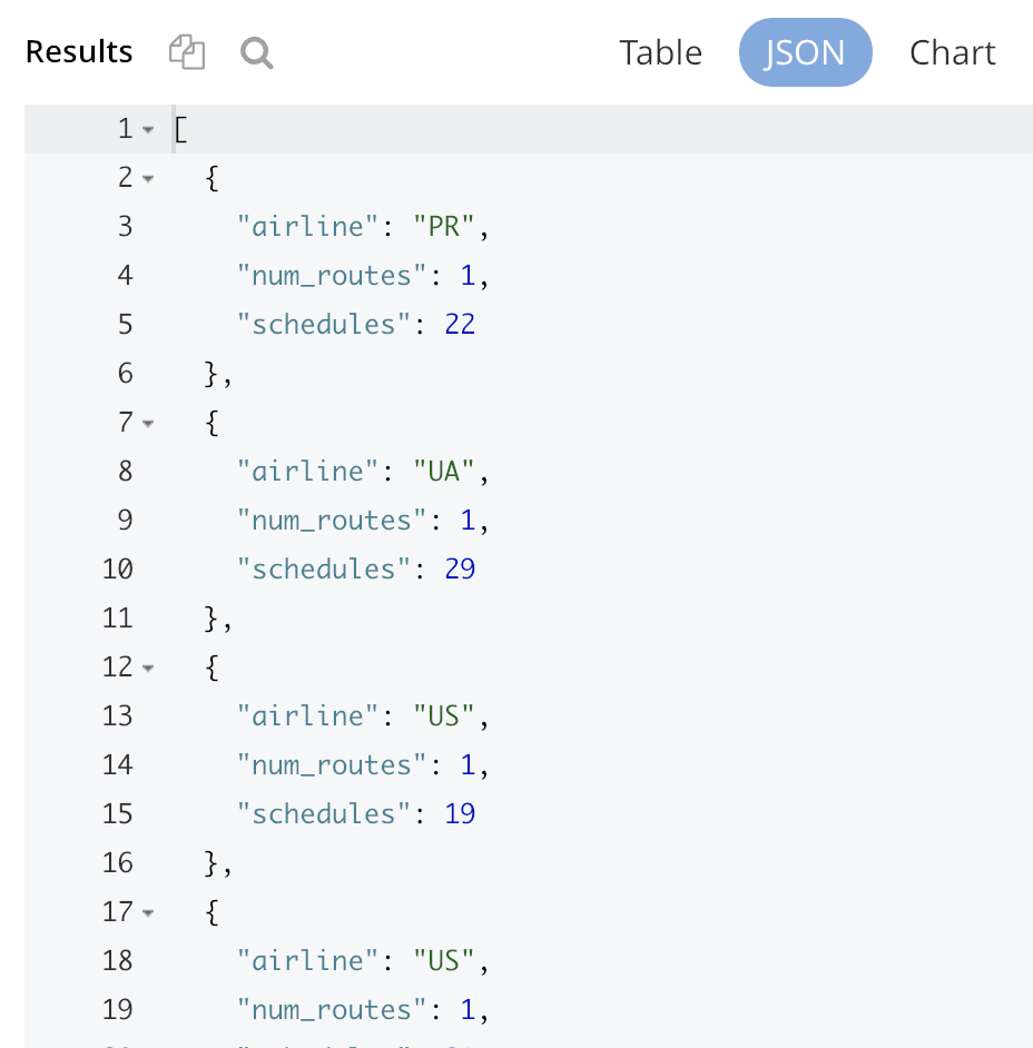

Interactive charting capability
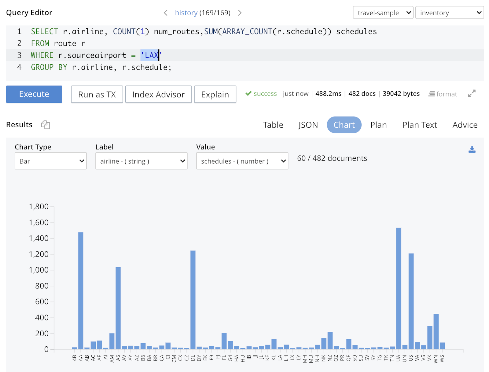
For many releases the workbench has supported copying data in tab-separated format to allow pasting into other visualization/analysis tools like Excel or Tableau. This is still possible for more complex analysis, but bringing charts into the workbench allows a much tighter iterative loop between querying and visualization. Developers can now interactively work on the query statement, then execute it to immediately get the chart view.
In the screenshot below, the query predicate has been changed to retrieve the number of scheduled flights by airlines that fly out of LAX airport.
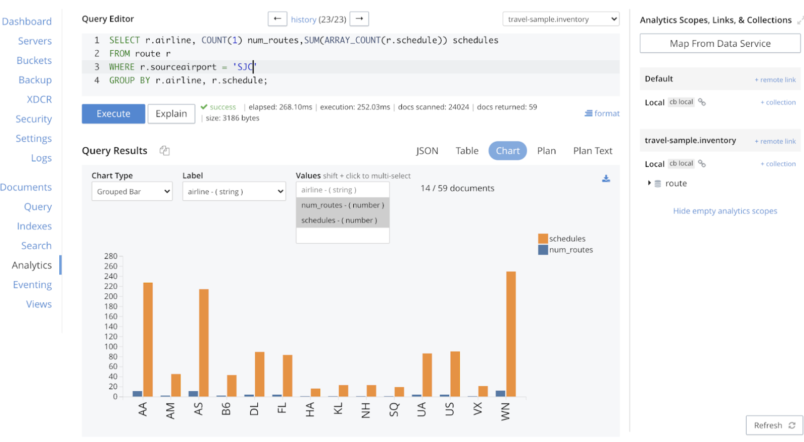
Charting with Analytics Service
The same charting capability is also available with the Analytics service. Here we use the Group Bar chart to display both the “number of routes” 그리고 “number of scheduled flights” in the chart:
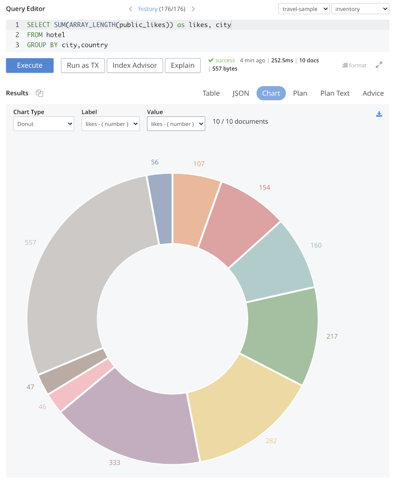
Examples of different chart types
1- Use a Donut chart to show the total number of public likes from all the hotels by city
2- Use the X-Y chart to show the potential relationship between the number of public likes and the overall rating of hotels by city

Share the chart with others
The chart can be downloaded as a scalable vector graphics (SVG) file. This is a portable file format that can be displayed in all browsers.

Note that the SVG format allows scaling without pixelating the image. It can also be imported into Microsoft Powerpoint.
추가 리소스
To learn more about Couchbase Query & Analytics Charting capabilities, check out the following resources:

댓글 남기기
댓글을 달기 위해서는 로그인해야합니다.