전에도 들어보셨을 겁니다: "측정된 것은 반드시 실행됩니다."
관찰하고 측정하는 것이 곧 개선할 수 있는 것입니다.
개선의 핵심은 먼저 다음과 같은 사항을 파악하는 것입니다. 무엇 를 사용하여 관련 지표를 측정한 다음 수집합니다. 이러한 지표를 사용하여 기본 작업을 조정하고 변경 사항의 효과를 분석할 수 있습니다. 그런 다음 충분히 개선될 때까지 이 과정을 반복하세요.
Couchbase에서는 일상적인 운영의 일부를 개선해야 했기 때문에 문제를 식별하고 개선 사항을 추적하는 데 도움이 되는 통합 가시성 대시보드를 만들었습니다. 우리는 다음과 같은 조합을 사용했습니다. 프로메테우스를 사용하여 시계열 데이터의 저장 및 쿼리를 간소화합니다. Grafana를 사용하여 멋진 데이터 시각화를 만들 수 있습니다. 또한 카우치베이스 를 사용하여 나중에 사용할 수 있도록 기록 데이터를 저장합니다. 전체 텍스트 검색 그리고 분석 도구.
이 문서에서는 Prometheus, Grafana 및 Couchbase를 사용하여 자신만의 통합 가시성 대시보드를 구축하는 방법을 안내합니다.
사내 데이터 원본 파이프라인은 데이터 시각화 소프트웨어와 마찬가지로 다를 수 있습니다. 하지만 오늘 보여드리는 단계는 여러 도구와 배포에 적용할 수 있습니다.
일반 통합 가시성 대시보드: 디자인 및 아키텍처
재사용 가능하고 확장 가능한 도구를 구축하려면 먼저 일반적인 디자인과 템플릿으로 작업하는 것이 좋습니다. 그 다음에는 필요에 따라 사용자 지정할 수 있습니다. 이 접근 방식을 사용하면 향후 대시보드를 빠르고 쉽게 개발할 수 있습니다.
아래 다이어그램은 우리가 함께 구축할 통합 가시성 대시보드의 일반적인 아키텍처를 보여줍니다:
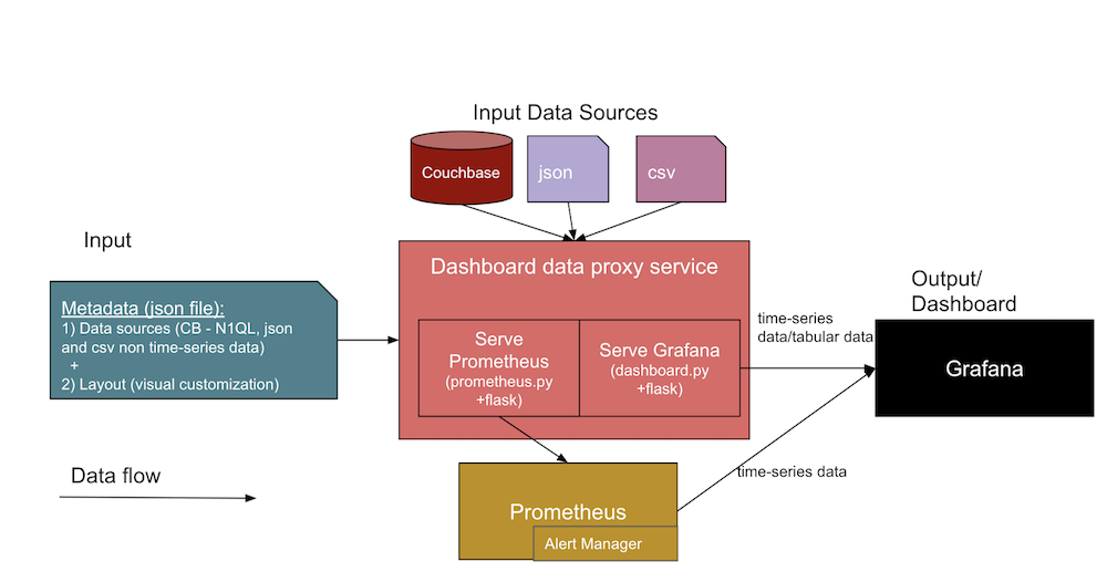
이 아키텍처에서는 두 개의 서로 다른 데이터 입력이 대시보드 서비스에 대한 인터페이스를 형성합니다. 아래에서 각각에 대해 자세히 살펴보겠습니다.
- 대시보드에 대한 JSON 메타데이터
- 데이터 소스 정의 - 데이터 소스(예: DB URL, SQL, 자격 증명), 파일 경로 및 Jenkins 아티팩트 URL에 대한 정보를 포함합니다.
- 먼저 디자인한 다음 나중에 대시보드에서 패널의 템플릿으로 사용할 Grafana 레이아웃 템플릿(또는 시각적 대시보드 보기)입니다.
- 실제 데이터 소스 파일은
.json그리고.csv파일과 카우치베이스.- 이러한 통합 가시성 대시보드의 디자인은 Couchbase Server와 같은 다양한 데이터 원본과 다음과 같은 직접 파일을 지원합니다. JSON 문서 및 CSV(쉼표로 구분된 값) 파일을 사용할 수 있습니다. 데이터베이스 프록시 서비스 코드를 확장할 수 있습니다(
dashboard.py)를 사용하여 필요에 따라 다른 데이터 형식을 구문 분석할 수 있습니다.
- 이러한 통합 가시성 대시보드의 디자인은 Couchbase Server와 같은 다양한 데이터 원본과 다음과 같은 직접 파일을 지원합니다. JSON 문서 및 CSV(쉼표로 구분된 값) 파일을 사용할 수 있습니다. 데이터베이스 프록시 서비스 코드를 확장할 수 있습니다(
예상 출력은 위에 나열된 두 입력에서 수집된 Grafana 대시보드 UI와 Prometheus 시계열 메트릭이 될 것입니다. 위 다이어그램의 중앙 부분은 대시보드 생성을 지원하는 컬렉션의 다양한 서비스를 보여줍니다.
아키텍처 다이어그램에 포함된 다양한 측면과 서비스에 대해 자세히 살펴보겠습니다:
- 대시보드 프록시 서비스:
- 이것은 일반적인 파이썬 플라스크 웹 앱 서비스입니다(
dashboard.py)와 상호 작용하여 표 형식 데이터 및 다음과 같은 기타 API를 제공하는 Grafana 서비스입니다./query,/추가,/수입그리고/수출엔드포인트를 사용할 수 있습니다. 비슷한 템플릿을 개발하여 Grafana의 패널에 대한 일반 템플릿(JSON)을 만들고 그래프 데이터 포인트와 표 형식 데이터 포인트를 대상 JSON으로 첨부하여 Grafana 대시보드에 표시할 수 있습니다.
- 이것은 일반적인 파이썬 플라스크 웹 앱 서비스입니다(
- 프로메테우스 내보내기 서비스:
- 이것은 사용자 지정 Prometheus 내보내기입니다(예
prometheus.py) 플라스크 웹 앱 서비스는 데이터 소스에 연결하여 Prometheus 자체의 요청을 처리하는 서비스입니다. 높은 수준에서, 이것은 Prometheus와 데이터 소스 사이의 다리 역할을 합니다. 이 서비스는 데이터 소스를 시계열로 유지 관리해야 하는 경우에만 필요합니다(많은 트렌드에 이 서비스가 필요합니다).
- 이것은 사용자 지정 Prometheus 내보내기입니다(예
- Grafana 서비스:
- 이것은 패널을 만들고 대시보드로 표시하는 데 사용하는 일반 Grafana 도구 자체입니다.
- 프로메테우스 서비스:
- 이것은 메트릭을 시계열 데이터로 보관하는 일반 Prometheus 도구 자체입니다.
- 알림 관리자:
- 알림 관리자에는 특정 임계값이 충족될 때 알림을 수신하는 사용자 지정 알림 규칙이 있습니다.
- 기타 서비스:
- 카우치베이스: 이미 사용 중일 수도 있습니다. NoSQL 문서 데이터베이스를 사용하는 것이 좋지만, 그렇지 않은 경우 컨테이너를 통해 또는 다른 호스트에 직접 설치할 수 있습니다. 카우치베이스는 데이터를 JSON 문서로 저장하거나, 상태 또는 트렌드 데이터를 준비하는 동안 기록 추세를 위해 필수 필드를 별도의 문서로 저장하도록 할 수 있습니다.
- Docker: 이 컨테이너화된 서비스 배포를 사용하려면 호스트에 도커 에이전트 소프트웨어를 설치해야 합니다.
대시보드 JSON 구조 샘플
아래 표에서 입력 메타데이터와 입력 데이터 소스의 구조 샘플을 확인할 수 있습니다.
| 입력 메타데이터 JSON 구조: | 입력 데이터 소스 구조: |
{ |
//Couchbase 소스 |
통합 가시성 대시보드 서비스 배포하기
사용 도커-컴포즈 파일을 실행하여 위의 통합 가시성 대시보드 아키텍처 다이어그램에 표시되는 모든 필수 서비스(예: 대시보드 프록시, Grafana, Prometheus, Exporter, 알림 관리자)를 불러올 수 있습니다. 증가하는 대용량 데이터를 저장하기 위해 다른 호스트에 Couchbase를 설치할 수 있습니다.
불러오기: 도커-컴포지트 업
다음으로 다음을 방문하세요. https://host:3000 를 클릭합니다.
다운시키려면: 도커-컴포지트 다운
|
1 2 3 4 5 6 7 8 9 10 11 12 13 14 15 16 17 18 19 20 21 22 23 24 25 26 27 28 29 30 31 32 33 34 35 36 37 38 39 40 41 42 43 44 45 46 47 48 49 50 |
version: "2" services: dashboard: restart: unless-stopped build: ../../ ports: - 5001:5000 environment: - GRAFANA_HOST=https://admin:password@grafana:3000 volumes: - ./config/targets.json:/app/targets.json grafana: image: grafana/grafana:8.0.1 restart: unless-stopped volumes: - ./config/grafana:/var/lib/grafana environment: GF_INSTALL_PLUGINS: "simpod-json-datasource,marcusolsson-csv-datasource,ae3e-plotly-panel" GF_AUTH_ANONYMOUS_ENABLED: "true" GF_PLUGINS_ALLOW_LOADING_UNSIGNED_PLUGINS: "ae3e-plotly-panel" GF_RENDERING_SERVER_URL: https://renderer:8081/render GF_RENDERING_CALLBACK_URL: https://grafana:3000/ ports: - 4000:3000 renderer: image: grafana/grafana-image-renderer:latest prometheus: restart: unless-stopped image: prom/prometheus volumes: - ./config/prometheus.yml:/etc/prometheus/prometheus.yml - ./config/alert.rules.yml:/etc/prometheus/alert.rules.yml exporter: restart: unless-stopped build: ../../exporter volumes: - ./config/queries.json:/app/queries.json alertmanager: restart: unless-stopped image: prom/alertmanager ports: - 9093:9093 volumes: - ./config/alertmanager.yml:/etc/alertmanager/alertmanager.yml - ./config/alert_templates:/etc/alertmanager/templates |
위의 서비스 참조 파일 콘텐츠(또는 간결하게 하기 위한 스니펫)는 다음에서 찾을 수 있습니다. 아래 구현 섹션을 참조하십시오..
이러한 도구를 사용하여 요구사항에 맞는 다양한 대시보드를 만들 수 있습니다. 세 가지 유형의 대시보드 예시를 통해 어떤 것이 가능한지 아이디어를 얻을 수 있습니다.
대시보드 예시: 개요
| # | 대시보드 | 측정 | 메트릭 |
| 1 | 기능 회귀 테스트 주기 대시보드 | 빌드 수준과 컴포넌트 수준 모두에서 기능 회귀 테스트 주기 사이의 추세 | 총 테스트, 통과, 실패, 중단, 총 시간, 새로 실행 시간 등입니다. |
| 2 | 정적 가상 머신 및 동적 가상 머신을 포함한 인프라 가상 머신 사용 대시보드 | 리소스 활용 및 기록 | 활성 개수, 사용 가능한 개수, 일, 주, 월별 계산 시간/최대/작성된 개수 |
| 3 | 인프라 가상 머신 상태 대시보드, 정적 서버, 젠킨스 슬레이브 가상 머신 | VM 상태 모니터링, 경고 및 VM의 이력 추적 | ssh_fail, 풀_os 대 실제_os, CPU-메모리-디스크-스왑 사용량, 파일 설명자, 방화벽 규칙, 풀_맥주소 대 실제_맥주소, 부팅일, 총 및 제품 프로세스, 설치된 앱 버전 및 서비스 등을 확인할 수 있습니다. |
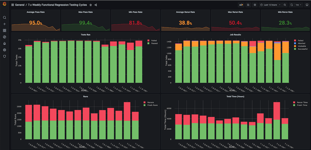
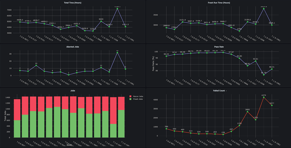
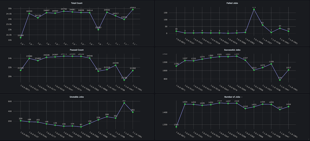
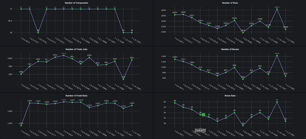
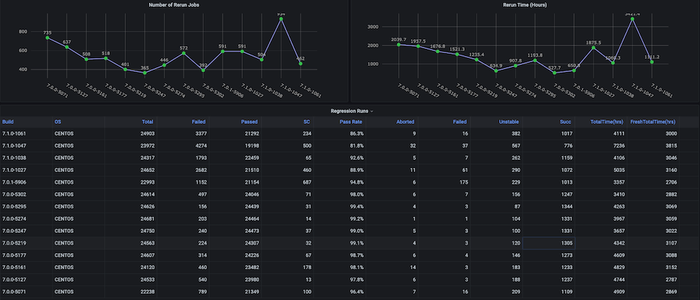
대시보드 #1: 기능 회귀 테스트 주기 대시보드
문제: 이 대시보드를 직접 만들기 전에는 총 소요 시간, 합격률, 새로 실행 대 재실행(예: 인프라 문제로 인한), 일관되지 않은 중단 및 실패 횟수와 같은 메트릭이 포함된 회귀 테스트 주기에 대한 추세 그래프가 없었으며, 별도의 구성 요소 또는 모듈 수준 추세도 없었습니다.
솔루션: 계획은 이미 Couchbase 버킷에 저장되어 있는 테스트 데이터를 분석하는 실행 분석기 스크립트를 만드는 것이었습니다. 그 후, 마지막에 대한 시계열 데이터를 가져옵니다. n 각 빌드에 대한 빌드 수 및 대상 메트릭을 확인할 수 있습니다.
대시보드 스냅샷:
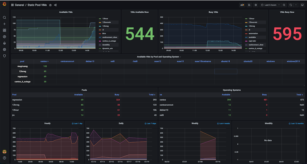
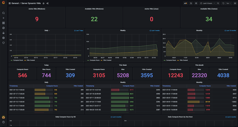
대시보드 #2: 인프라 리소스/VM 사용량 대시보드
문제입니다: 이 대시보드를 구축하기 전에는 많은 수의 정적 및 동적 가상 머신을 보유하고 있었지만 하드웨어 리소스가 어떻게 활용되는지 추적할 수 없었습니다. 당시 사용된 활성 가상 머신, 사용 가능한 개수, 머신 사용 시간, 일별, 주별 또는 월별 컴퓨팅 시간 등의 메트릭에 대한 인사이트가 없었습니다.
솔루션: 저희 계획은 먼저 동적 IP 할당 및 해제, 정확한 생성 시간, 해제 시간, 풀과 같은 그룹화 등 모든 VM에 대한 데이터를 수집하는 것이었습니다. 이 데이터의 대부분은 이미 카우치베이스 서버 (각 서비스 관리자가 관리). 유연성 사용 SQL++ 쿼리 언어 (일명 N1QL)을 사용하여 이 통합 가시성 대시보드에 표시하려는 그래프에 적합한 형식으로 해당 데이터를 추출할 수 있었습니다.
대시보드 스냅샷:
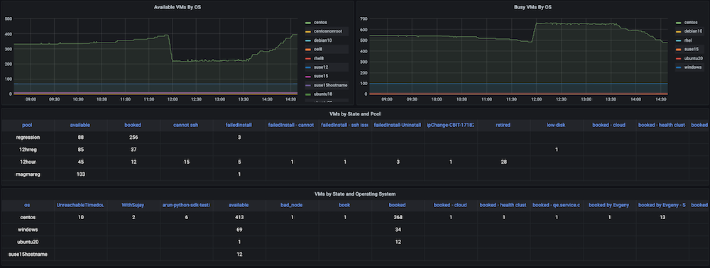
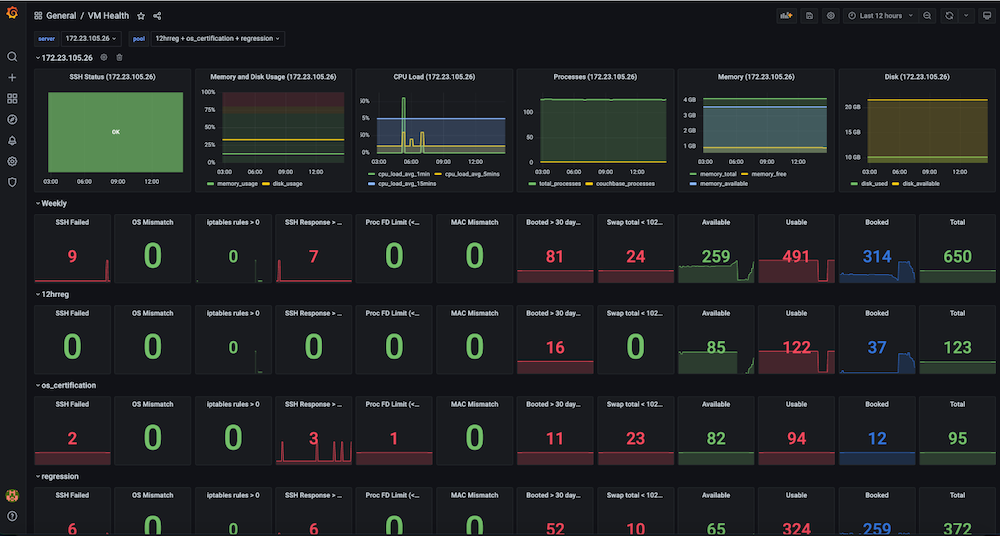
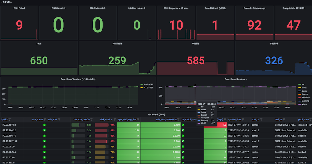
대시보드 #3: 인프라 VM 상태 대시보드
문제입니다: 이 대시보드가 생기기 전에는 회귀 테스트 실행이 일관성 없이 실패하고 VM에 문제가 발생했습니다. 일부 문제에는 SSH 실패, OS 불일치, VM IP 전환, 너무 많은 열린 파일, 스왑 문제, 재부팅 필요, 여러 실행 간에 중복된 IP, 높은 메모리 사용량, 디스크 가득 찼음(...) 등이 있었습니다./ 또는 /데이터), 엔드포인트 연결을 중지하는 방화벽 규칙, 높은 메모리로 인한 슬레이브 문제, 디스크 사용량 등이 모두 흔했습니다. 이러한 메트릭을 보고 관찰할 수 있는 통합 가시성 대시보드도 없었고 테스트 인프라 상태에 대한 확인 및 알림도 없었습니다.
솔루션: 다음과 같은 대상 VM에 대한 메트릭 데이터를 캡처하는 자동 주기적 상태 검사를 만들기로 결정했습니다. ssh_fail, pool_os vs real_os, CPU-메모리-디스크-스왑 사용법, 파일 설명자, 방화벽 규칙, pool_mac_address vs real_mac_address, 부팅 일수, 총 및 Couchbase 프로세스, 설치된 Couchbase 버전 및 서비스. (총 50개의 메트릭을 캡처했습니다). 이러한 메트릭은 Grafana에 표시되는 Prometheus 엔드포인트로 노출되며, 이 정보는 향후 데이터 분석을 위해 Couchbase에도 저장됩니다. 또한 문제에 대한 주요 상태 메트릭을 모니터링하여 신속한 개입을 가능하게 하고 최종적으로 테스트 실행의 안정성을 높이기 위해 알림을 생성했습니다.
대시보드 스냅샷:
구현
지금까지 통합 가시성 대시보드의 높은 수준의 아키텍처, 필요한 서비스, 필요한 대시보드의 종류, 그리고 이러한 서비스를 배포하는 방법에 대해 살펴보았습니다. 이제 몇 가지 구현 세부 사항을 살펴볼 차례입니다.
첫 번째 단계는 메트릭의 수집 및 저장과 대시보드의 데이터 시각화입니다. 대부분의 데이터 저장 및 표시 단계는 모든 사용 사례에서 유사하지만, 메트릭 데이터 수집은 타깃으로 선택한 메트릭에 따라 다릅니다.
대시보드에 사용할 상태 데이터를 얻는 방법
인프라 모니터링 사용 사례의 경우, 안정적인 인프라를 만들기 위해 수백 개의 VM에서 다양한 상태 메트릭을 수집해야 합니다.
이 단계에서는 VM에 대한 SSH 연결을 병렬로 수행하고(멀티프로세싱 풀) 필요한 데이터를 수집하는 Python 스크립트를 만들었습니다. 저희의 경우 이 스크립트를 주기적으로 실행하여 상태 데이터(CSV)를 수집한 다음 이를 Couchbase 데이터베이스에 저장하는 Jenkins 작업도 있습니다.
Prometheus에서 제공하는 즉시 사용 가능한 노드 내보내기 대신 이 사용자 정의 스크립트를 만든 이유는 일부 필수 메트릭이 지원되지 않았기 때문입니다. 또한 이 솔루션은 1000대 이상의 서버에 새 소프트웨어를 배포하고 유지 관리하는 것보다 더 간단했습니다. 아래 코드 스니펫은 VM 수준에서 수행되는 몇 가지 검사를 보여줍니다.
|
1 2 3 4 5 6 7 8 9 10 11 12 13 14 15 16 17 18 19 20 21 22 23 24 25 26 27 28 29 30 31 32 33 34 35 |
def check_vm(os_name, host): client = SSHClient() client.set_missing_host_key_policy(AutoAddPolicy()) ... cpus = get_cpuinfo(client) meminfo = get_meminfo(client) diskinfo = get_diskinfo(client) uptime = get_uptime(client) ... return ssh_status, '', ssh_resp_time, real_os_version, cpus, meminfo, diskinfo, uptime, uptime_days, systime, cpu_load, cpu_total_processes, fdinfo, \ iptables_rules_count, mac_address, swapinfo, cb_processes, cb_version, cb_running_serv, cb_ind_serv def get_cpuinfo(ssh_client): return ssh_command(ssh_client,"cat /proc/cpuinfo |egrep processor |wc -l") def get_meminfo(ssh_client): return ssh_command(ssh_client,"cat /proc/meminfo |egrep Mem |cut -f2- -d':'|sed 's/ //g'|xargs|sed 's/ /,/g'|sed 's/kB//g'") def get_diskinfo(ssh_client): return ssh_command(ssh_client,"df -ml --output=size,used,avail,pcent / |tail -1 |sed 's/ \+/,/g'|cut -f2- -d','|sed 's/%//g'") def get_uptime(ssh_client): return ssh_command(ssh_client, "uptime -s") def get_cpu_users_load_avg(ssh_client): return ssh_command(ssh_client, "uptime |rev|cut -f1-4 -d','|rev|sed 's/load average://g'|sed 's/ \+//g'|sed 's/users,/,/g'|sed 's/user,/,/g'") def get_file_descriptors(ssh_client): return ssh_command(ssh_client, "echo $(cat /proc/sys/fs/file-nr;ulimit -n)|sed 's/ /,/g'") def get_mac_address(ssh_client): return ssh_command(ssh_client, "ifconfig `ip link show | egrep eth[0-9]: -A 1 |tail -2 |xargs|cut -f2 -d' '|sed 's/://g'`|egrep ether |xargs|cut -f2 -d' '") def get_mac_address_ip(ssh_client): return ssh_command(ssh_client, "ip a show `ip link show | egrep eth[0-9]: -A 1 |tail -2 |xargs|cut -f2 -d' '|sed 's/://g'`|egrep ether |xargs|cut -f2 -d' '") |
아래 코드 스니펫은 키-값 연산, 문서 가져오기 또는 데이터베이스에 문서 저장을 통해 Python SDK 3.x를 사용하여 Couchbase에 연결하는 방법을 보여줍니다.
|
1 2 3 4 5 6 7 8 9 10 11 12 13 14 15 16 17 |
try: self.cb_cluster = Cluster("couchbase://"+self.cb_host, ClusterOptions(PasswordAuthenticator(self.cb_username, self.cb_userpassword), \ timeout_options=ClusterTimeoutOptions(kv_timeout=timedelta(seconds=10)))) self.cb_b = self.cb_cluster.bucket(self.cb_bucket) self.cb = self.cb_b.default_collection() except Exception as e: print('Connection Failed: %s ' % self.cb_host) print(e) def get_doc(self, doc_key, retries=3): # .. return self.cb.get(doc_key) def save_doc(self, doc_key, doc_value, retries=3): #... self.cb.upsert(doc_key, doc_value) #... |
대시보드 프록시 서비스 구현하기
테스트 통합 가시성 사용 사례의 경우, 데이터는 Jenkins 아티팩트 URL과 Couchbase Server에 있습니다. 이러한 여러 데이터 소스(CSV, DB)를 서로 연결하기 위해, 저희는 Grafana의 요청을 수락하고 Grafana가 이해하는 데이터 형식을 반환하는 프록시 API 서비스를 만들었습니다.
아래 코드 스니펫은 구현 및 서비스 준비에 대한 세부 정보를 제공합니다.
dashboard.py
|
1 2 3 4 5 6 7 8 9 10 11 12 13 14 15 16 17 18 19 20 21 22 23 24 25 26 27 28 29 |
# Dashboard API service @app.route("/query", methods=['POST']) def query(): """ /query responds to a Grafana data request and is formatted as either data points for time series data or rows and columns for tabular data """ for target in request.json['targets']: data_type = target['type'] if data_type == "timeseries": datapoints = calculate_datapoints(target) elif data_type == "table": datapoints = calculate_rows_and_columns(target) ... def calculate_datapoints(target): """ Returns data in a time series format datapoints is formatted as a list of 2 item tuples in the format [value, timestamp] """ ... if target['source'] == "couchbase": ... elif target['source'] == "json": ... elif target['source'] == "csv": |
도커파일
|
1 2 3 4 5 6 7 8 9 10 11 |
FROM ubuntu:latest ENV DEBIAN_FRONTEND "noninteractive" RUN apt-get update -y && apt-get install -y python3-dev python3-pip python3-setuptools cmake build-essential RUN mkdir /app COPY ./requirements.txt /app WORKDIR /app RUN pip3 install -r requirements.txt COPY ./dashboard.py /app COPY ./entrypoint.sh /app ENTRYPOINT ["./entrypoint.sh"] |
entrypoint.sh
|
1 2 |
#!/bin/bash python3 dashboard.py $GRAFANA_HOST |
요구 사항.txt
|
1 2 3 |
couchbase==3.0.7 Flask==1.1.2 requests==2.24.0 |
Grafana에서 표 형식의 데이터를 가져오는 방법
Grafana는 시계열 데이터를 보기에 훌륭한 도구입니다. 하지만 시계열이 아닌 데이터를 동일한 인터페이스에 표시하고 싶을 때가 있습니다.
우리는 이 목표를 달성하기 위해 플롯리 플러그인 라는 자바스크립트 그래프 라이브러리를 사용했습니다. 저희의 주요 사용 사례는 주간 회귀 테스트 실행에 대한 다양한 중요 지표의 추세를 보여주는 것이었습니다. 저희가 추적하고자 했던 가장 중요한 지표는 합격률, 테스트 횟수, 중단된 작업, 총 소요 시간이었습니다. Grafana 8 출시 이후 막대 그래프에 대한 지원이 제한되었습니다. 이 글을 쓰는 시점에서 막대 그래프 기능은 아직 베타 버전이며 스태킹과 같이 필요한 모든 기능을 제공하지 않습니다.
저희의 목표는 일반 CSV/JSON 파일 또는 Couchbase SQL++ 쿼리를 지원하고 Grafana에서 데이터를 테이블로 보는 것이었습니다. 이식성을 극대화하기 위해 데이터 소스와 Grafana 템플릿 레이아웃을 함께 정의하는 단일 파일을 만들고 싶었습니다.
표 형식의 데이터를 표시하는 데 사용할 수 있는 두 가지 옵션은 다음과 같습니다.
- Grafana용 UI 플러그인 작성
- 를 사용하여 JSON 프록시를 제공하세요. JSON 데이터 소스 플러그인
저희는 Grafana 플러그인 도구를 익히고 구성을 위한 별도의 UI 플러그인을 만드는 것보다 더 간단해 보였기 때문에 옵션 2를 구현하는 방법을 선택했습니다.
이 프로젝트를 완료한 이후 새로운 플러그인 가 출시되어 Grafana에 CSV 데이터를 직접 추가할 수 있게 되었습니다. CSV에서 표 형식의 데이터를 보는 것이 유일한 요구 사항이라면 이 플러그인이 좋은 솔루션입니다.
프로메테우스 서비스 구현하기
prometheus.yml
|
1 2 3 4 5 6 7 8 9 10 11 12 13 14 15 16 17 18 |
# Prometheus global config global: scrape_interval: 1m # Set the scrape interval to every 15 seconds. Default is every 1 minute. scrape_timeout: 30s # Alertmanager configuration alerting: alertmanagers: - static_configs: - targets: - alertmanager:9093 rule_files: - "alert.rules.yml" - job_name: "prometheus" static_configs: - targets: ["localhost:9090"] - job_name: "automation_exporter" static_configs: - targets: ["exporter:8000"] |
alert.rules.yml
|
1 2 3 4 5 6 7 8 9 10 11 12 13 14 15 16 17 18 19 |
groups: - name: alert.rules rules: - alert: PoolVMDown expr: vm_health_ssh_status == 0 for: 1m annotations: title: "Server Pool VM {{ $labels.ipaddr }} SSH Failed" description: "{{ $labels.ipaddr }} SSH failed with error: {{ $labels.ssh_error }}." labels: severity: "critical" - alert: PoolVMHighDiskUsage expr: disk_usage >= 95 for: 1m annotations: title: "Server Pool VM {{ $labels.ipaddr }} high disk usage" description: "{{ $labels.ipaddr }} has disk usage of {{ $value }}%" labels: severity: "critical" |
Prometheus 내보내기를 통해 사용자 지정 지표를 가져오는 방법
많은 클라우드 네이티브 서비스가 Prometheus와 직접 통합되어 모든 서비스에 대한 중앙 집중식 메트릭 수집이 가능합니다.
저희는 이 기술을 활용하여 기존 인프라를 모니터링할 수 있는 방법을 찾고 싶었습니다. Prometheus 메트릭 엔드포인트를 직접 노출하지 않는 서비스가 있는 경우, 이 문제를 해결하는 방법은 내보내기를 사용하는 것입니다. 실제로 클러스터의 모든 중요한 메트릭을 노출하는 Couchbase 익스포터도 있습니다. (참고: In 카우치베이스 서버 7.0Prometheus 엔드포인트를 직접 사용할 수 있으며, 내부적으로 Couchbase 7은 서버 통계 수집 및 관리를 위해 Prometheus를 사용하여 다음과 같은 서비스를 제공합니다. 웹 UI).
통합 가시성 대시보드를 만드는 동안 JSON 파일, CSV 파일, Couchbase 버킷에 다양한 데이터가 저장되어 있었습니다. 우리는 이 모든 데이터를 표 형식과 Prometheus를 사용하여 시계열 데이터로 Grafana에 표시할 수 있는 방법을 원했습니다.
Prometheus는 간단한 줄 기반 텍스트 출력을 기대합니다. 다음은 서버 풀 모니터링의 예시입니다:
|
1 2 |
available_vms{pool="12hrreg"} 1 available_vms{pool="regression"} 16 |
CSV 파일과 Couchbase에서 직접 데이터 소스를 구현하는 방법을 자세히 살펴보겠습니다.
데이터 소스로서의 CSV 파일
Prometheus는 엔드포인트를 폴링할 때마다 CSV를 가져오고, 각 열에 대해 메트릭을 노출하며, 구성에 레이블이 제공된 경우 여러 행에 대한 레이블을 추가합니다.
위의 예제에서 CSV는 다음과 같습니다:
|
1 2 3 |
pool,available_count 12hrreg,1 regression,16 |
데이터 소스로서의 카우치베이스
Prometheus는 엔드포인트를 폴링할 때마다 구성에 정의된 SQL++ 쿼리를 실행하고, 각 쿼리에 대해 메트릭을 노출하며, 구성에 레이블이 제공된 경우 여러 행에 대한 레이블을 추가합니다.
다음은 위 메트릭을 생성하는 SQL++ 응답 예시입니다:
|
1 2 3 4 5 6 7 8 |
[{ “pool”, “12hrreg”, “count”: 1 }, { “pool”, “regression”, “count”: 16 }] |
이 내보내기 파이썬 서비스는 /metrics 엔드포인트를 사용할 수 있습니다. 이러한 메트릭은 다음에서 정의됩니다. queries.json 를 사용하여 메트릭으로 노출할 쿼리와 CSV 열을 정의합니다. 아래 JSON 스니펫(간결성을 위해 축소됨)을 예로 참조하세요.
queries.json
|
1 2 3 4 5 6 7 8 9 10 11 12 13 14 15 16 17 18 19 20 21 22 23 24 25 26 27 28 29 30 31 32 33 34 35 36 37 38 39 40 41 42 43 44 45 46 47 48 49 50 51 52 53 54 55 56 |
{ "clusters": { "static_vms": { "host": "<ip-address>", "username": "Administrator", "password": "xxxx" }, ... }, "queries": [ { "name": "available_vms", "cluster": "static_vms", "query": "SELECT poolId as `pool`, COUNT(*) AS count FROM (SELECT poolId FROM `QE-server-pool` WHERE IS_ARRAY(poolId)=FALSE and state='available' UNION ALL SELECT poolId FROM `QE-server-pool` UNNEST poolId where `QE-server-pool`.state = 'available' ) AS pools group by poolId", "description": "Available VMs for each server pool", "value_key": "count", "labels": ["pool"] }, ... ], "csvs": { "vm_health": "https://<jenkins-host-job-url>/lastSuccessfulBuild/artifact/vm_health_info.csv/", ... }, "columns": [ { "name": "memory_usage", "csv": "vm_health", "description": "Memory usage", "column": "memory_use(%)", "labels": ["ipaddr"] }, { "name": "disk_usage", "csv": "vm_health", "description": "Disk usage", "column": "disk_use%", "labels": ["ipaddr"] }, { "name": "cpu_load_avg_5mins", "csv": "vm_health", "description": "CPU load average (5mins)", "column": "cpu_load_avg_5mins", "labels": ["ipaddr"] }, { "name": "vm_health_ssh_status", "csv": "vm_health", "description": "SSH Status", "column": "ssh_status", "labels": ["ipaddr", "ssh_error", "pool_state", "couchbase_version", "pool_ids"] }, ... ] } |
exporter.py
|
1 2 3 4 5 6 7 8 9 10 11 12 13 14 15 16 17 18 19 20 21 22 23 24 25 26 27 28 29 30 31 32 33 34 35 36 37 38 39 40 41 42 43 44 45 46 47 48 49 50 51 52 53 54 55 56 57 58 |
for options in settings['queries'] + settings["columns"]: log.info("Registered metrics collection for {}".format(options['name'])) def get_labels(row, options): rename_map = options.get("rename", {}) return ["{}=\"{}\"".format(rename_map[label] if label in rename_map else label, row[label]) for label in options["labels"]] def collect_cb(clusters, metrics, options): rows = clusters[options["cluster"]].query(options["query"]).rows() for row in rows: if len(options["labels"]) > 0: labels = get_labels(row, options) metrics.append("{}{{{}}} {}".format( options["name"], ",".join(labels), row[options["value_key"]])) else: metrics.append("{} {}".format( options["name"], row[options["value_key"]])) def collect_csv(metrics, options) csvfile = requests.get(csvs[options["csv"]]).text.splitlines() reader = DictReader(csvfile) for row in reader: if options["column"] not in row or row[options["column"]] == "": continue if len(options["labels"]) > 0: labels = get_labels(row, options) metrics.append("{}{{{}}} {}".format( options["name"], ",".join(labels), row[options["column"]])) else: metrics.append("{} {}".format( options["name"], row[options["column"]])) @app.route("/metrics") def metrics(): metrics = [] clusters = {} for [cluster_name, options] in settings['clusters'].items(): if cluster_name not in clusters: try: clusters[cluster_name] = Cluster('couchbase://'+options['host'], ClusterOptions( PasswordAuthenticator(options['username'], options['password']))) except Exception as e: log.warning("Couldn't connect to cluster {}".format(e)) log.debug("Connected to {}".format(options['host'])) for options in settings["queries"] + settings["columns"]: log.debug("Collecting metrics for {}".format(options["name"])) try: if "cluster" in options: collect_cb(clusters, metrics, options) elif "csv" in options: collect_csv(metrics, options) else: raise Exception("Invalid type") except Exception as e: log.warning("Error while collecting {}: {}".format( options["name"], e)) return Response("\n".join(metrics), mimetype="text/plain") |
알림 관리자 서비스 구현하기
Prometheus는 시간 경과에 따라 특정 메트릭을 추적하는 알림 기능도 지원합니다. 해당 지표가 결과를 반환하기 시작하면 알림이 트리거됩니다.
위의 예에서는 회귀 풀에 사용 가능한 서버가 없는 경우에 대한 알림을 추가할 수 있습니다. 쿼리를 다음과 같이 지정하면 available_vms{pool="regression"} == 0 이 있을 때 시리즈를 반환하는 0 를 사용할 수 있습니다. 추가하면 Prometheus가 이를 추적합니다(기본값은 매분). 이 작업이 끝나면 Prometheus UI를 방문하면 알림 탭에 어떤 알림이 실행되고 있는지 확인할 수 있습니다.
알림 관리자를 사용하면 한 단계 더 나아가 커뮤니케이션 서비스를 연결하여 예를 들어 알림이 발생했을 때 이메일이나 Slack 채널을 통해 Prometheus가 사용자에게 알림을 보내도록 할 수 있습니다. 즉, 문제가 발생하면 원하는 방법을 통해 즉시 알림을 받을 수 있습니다. Couchbase에서는 서버의 디스크 사용량이 많을 때와 SSH를 통해 서버에 연결할 수 없을 때 알림을 받도록 경고를 설정했습니다. 아래 예시를 참조하세요:
alertmanager.yml
|
1 2 3 4 5 6 7 8 9 10 11 12 13 14 15 16 17 18 |
global: resolve_timeout: 1m smtp_from: qa@couchbase.com smtp_smarthost: mail-com.mail.protection.outlook.com:25 route: group_by: ["alertname"] group_wait: 10s group_interval: 10s repeat_interval: 24h receiver: "infra-email" matchers: - alertname =~ PoolVMDown|PoolVMOSMismatch|PoolVMHighDiskUsage|SlaveVMHighDiskUsage|SlaveVMHighDiskUsageData receivers: - name: "infra-email" email_configs: - to: jake.rawsthorne@couchbase.com,jagadesh.munta@couchbase.com |
결론
결론적으로, 데이터 시각화의 강력한 기능을 통해 구현 또는 사용 사례에서 가장 중요한 메트릭에 집중하는 데 도움이 되는 통합 가시성 대시보드를 만든 경험을 통해 많은 것을 배울 수 있기를 바랍니다.
저희의 경우 이러한 노력을 통해 서버 인프라와 테스트 안정성 문제를 찾을 수 있었습니다. 대시보드를 구축함으로써 테스트 실패 횟수와 여러 제품 릴리스에 걸리는 총 회귀 시간도 줄었습니다.
이 안내를 통해 앞으로 더 나은 통합 가시성 대시보드를 구축하는 데 도움이 되기를 바랍니다.
또한, 목표 지표 개선에 대한 피드백을 제공해 주신 Raju와 QE 팀에게도 특별한 감사의 말씀을 전합니다.
Couchbase에서 구축해 보시겠습니까?

안녕하세요 이것은 매우 좋은 블로그이지만 실행 방법과 같은 여러 단계에서 불완전한 것 같습니다. 이 실행을 시도하고 싶기 때문에 git 코드를 도와주세요. 카우치베이스 사용 방법과 코드의 게시물에 사용되는 양식에 대한 정보가 매우 적습니다. 일부 저장소와 전체 지침에 저장소 코드가 있으면 도와 주거나 제안하십시오.