
We are thrilled to announce the launch of the Power BI Connector for Couchbase Analytics! This exciting development opens up a world of possibilities for seamlessly visualizing Couchbase Analytics JSON data directly in Microsoft Power BI.
Couchbase Analytics stores data in JSON format, while Power BI operates as a relational business intelligence connector tool. The introduction of the Power BI connector for Couchbase Analytics is a game changer for Power BI developers and analysts using Couchbase Analytics. It facilitates the transformation of raw data into meaningful insights, enabling quicker visual data discovery and visualization within Power BI, a widely used business intelligence tool.
How does the Power BI connector work?
The Couchbase Analytics Power BI connector works in five easy steps:
- Create tabular analytics views – A tabular analytics view is a non-materialized view created on Couchbase Analytics that defines a schema and primary/foreign keys for a collection or a subquery.
- Download the Power BI connector – Download the Power BI connector and follow the instructions to copy them to the appropriate folders.
- Download ODBC driver – Download the ODBC driver and follow the instructions to install the prerequisites and the driver.
- Create ODBC DSN – Launch ODBC Data Source Administrator (64 bit) and create User DSN.
- Launch Power BI Desktop – Connect to Couchbase Analytics server and derive rich visual insights.
Let’s walk through an example using this list 의 companies in the S&P 500.
Power BI connector to build visual dashboards
In this example, business users would like to:
- Create a clear and concise graph displaying company names and average dividend yields.
- Explore and visualize the association of each company with its respective sector.
- Introduce advanced filtering options, allowing users to filter companies by sector for a more focused analysis.
- Enable users to set specific criteria, filtering companies based on a price threshold (e.g., price >= 3.88).
- Generate a visual representation of market capitalization by sector, where each sector is depicted with varying sizes based on its market share.
Step 1: Create view
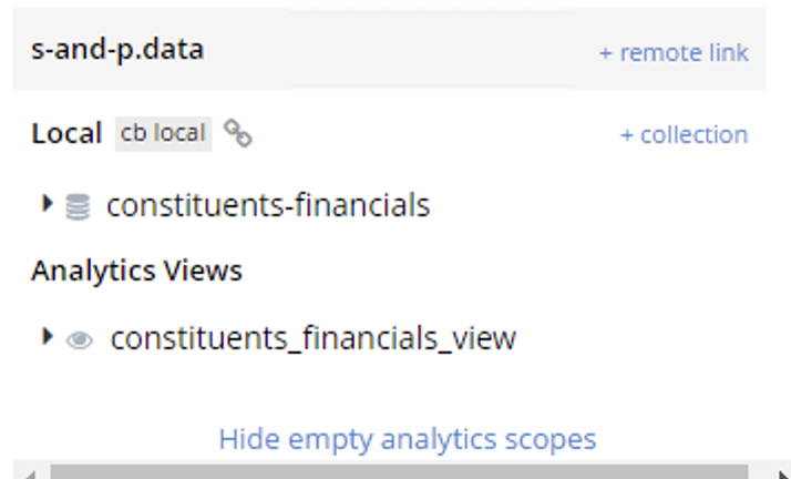
Create a tabular analytics view:
|
1 2 3 4 5 6 |
생성하다 ANALYTICS VIEW `s–그리고–p`.데이터.constituents_financials_view ( Dividend_Yield 더블, Company_Name 문자열, Sector 문자열, Market_Cap INT,Price 더블) DEFAULT NULL AS 선택 `Dividend Yield` AS Dividend_Yield, 이름 AS Company_Name, Sector, `Market Cap` AS Market_Cap,Price ~에서 `s–그리고–p`.데이터.`constituents–financials` |
Step 2: Configure DSN
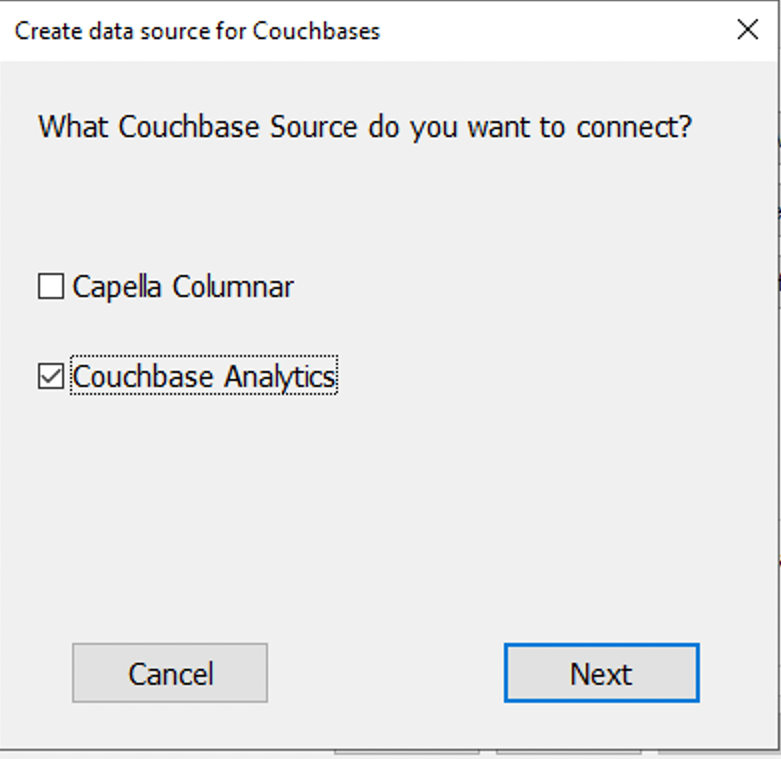
Select the Couchbase Source to connect:
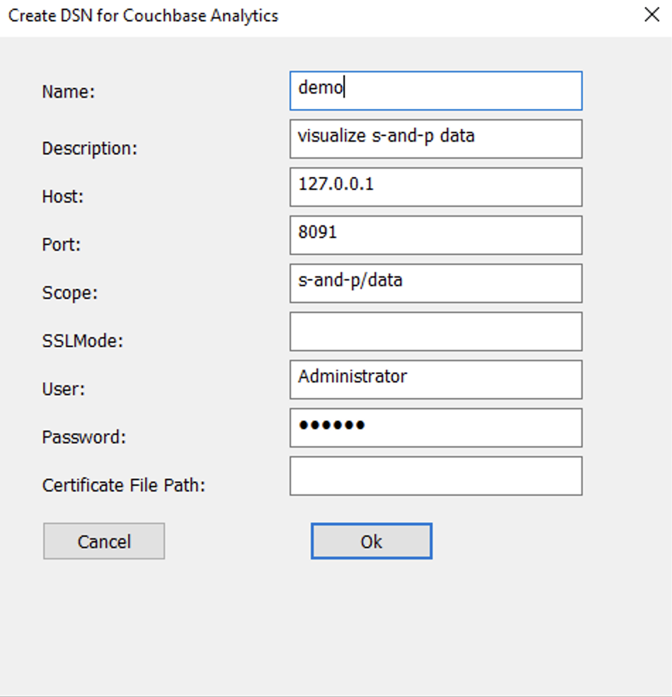
After downloading the ODBC driver, launch ODBC Data Source Administrator (64 bit) and create a User DSN.
Create DSN:
Step 3: Connect
Connect using Couchbase Connector:
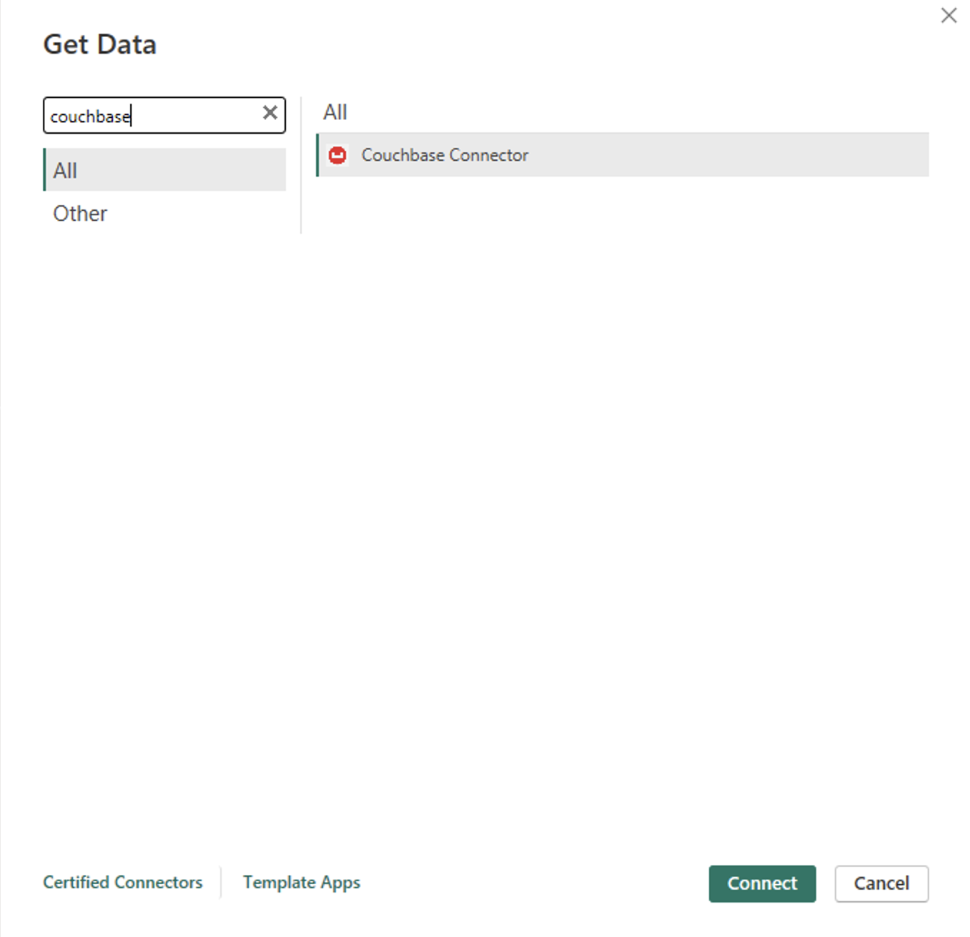
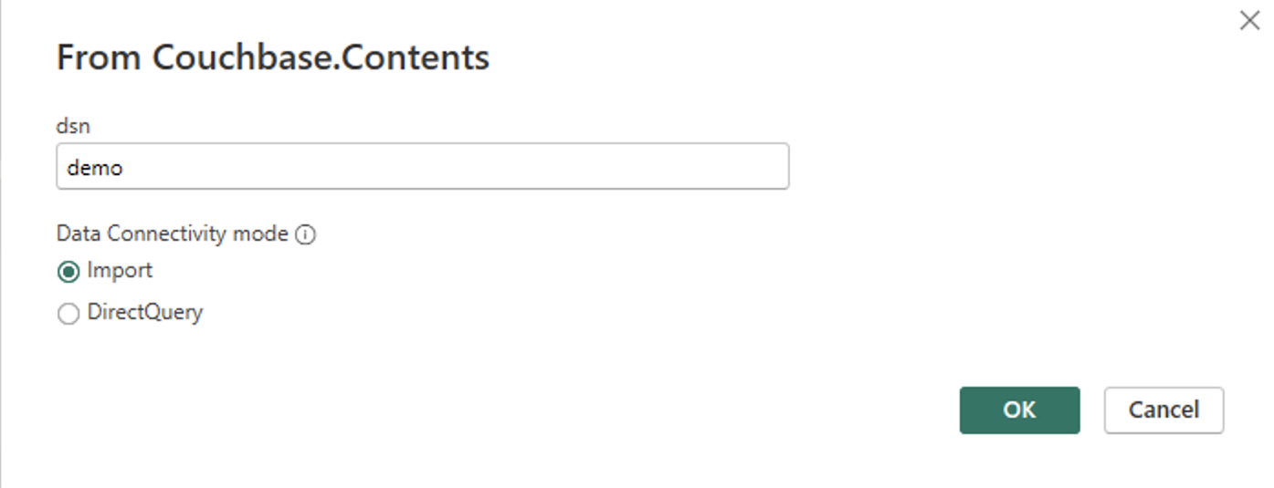
Enter DSN name and select the connectivity mode:
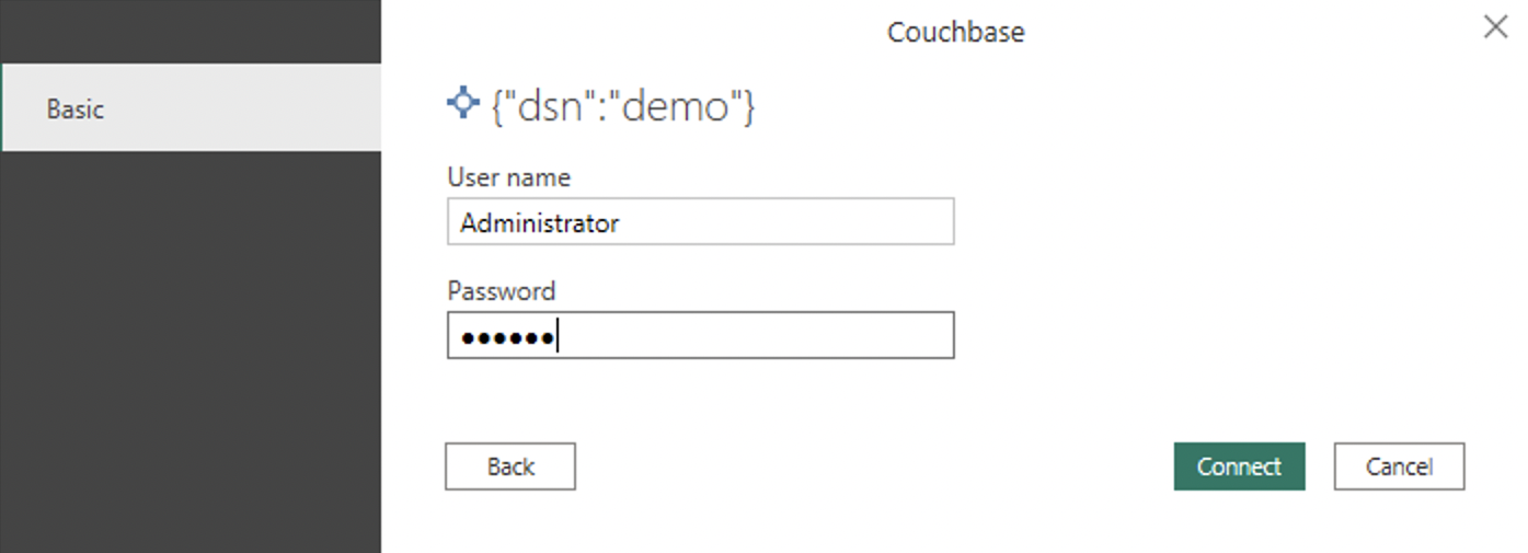
Enter credentials and connect:
Load the data:
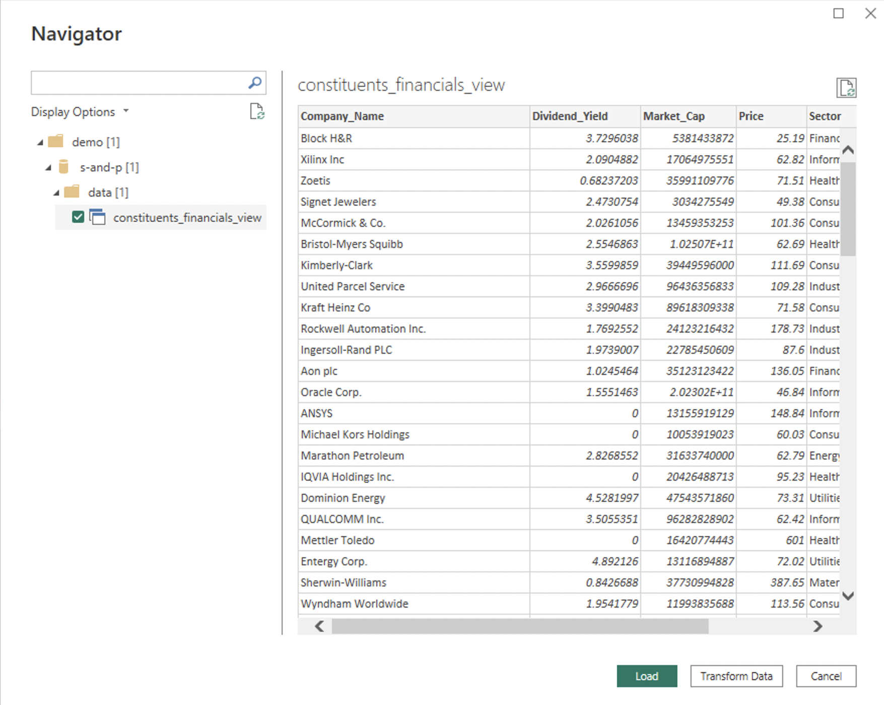
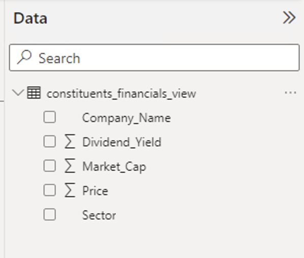
Once connected, go to the Data tab in Power BI to see the models:
Step 4: Visualize data
Create Report #1 in Power BI
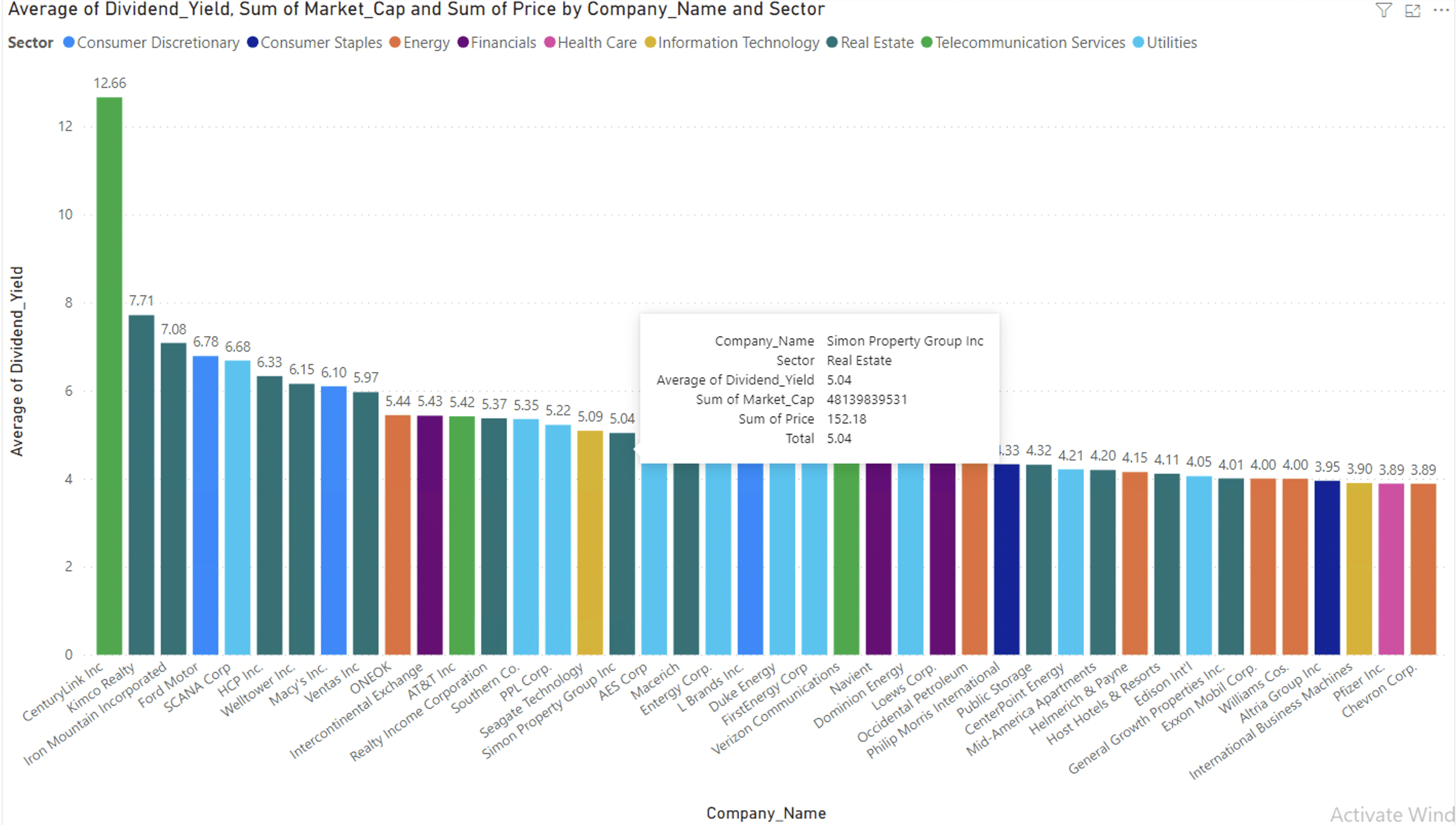
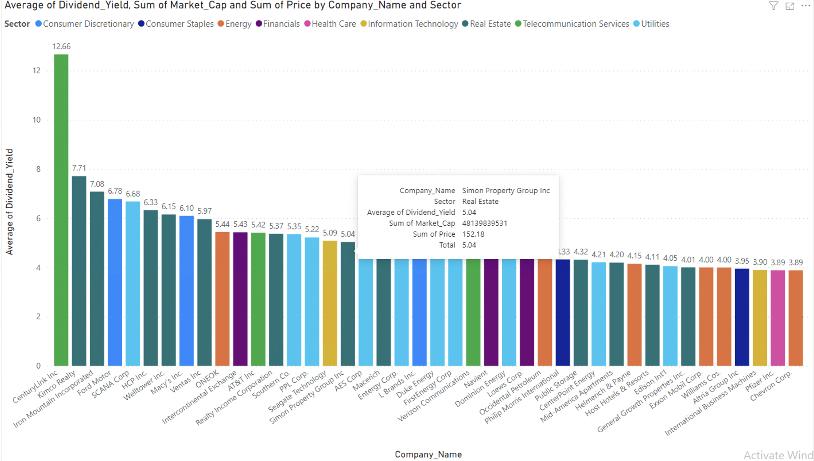
Create a bar graph illustrating Company Name 그리고 Average Dividend Yield. Enhance visual clarity by assigning distinct colors to bars based on their respective sectors. Additionally, incorporate toolkits to showcase the Price 그리고 Market_Cap for each company in the analysis. Add filter of Average of Dividend_yield > 3.88. Hover on each bar for more information.
Create Report #2 in Power BI
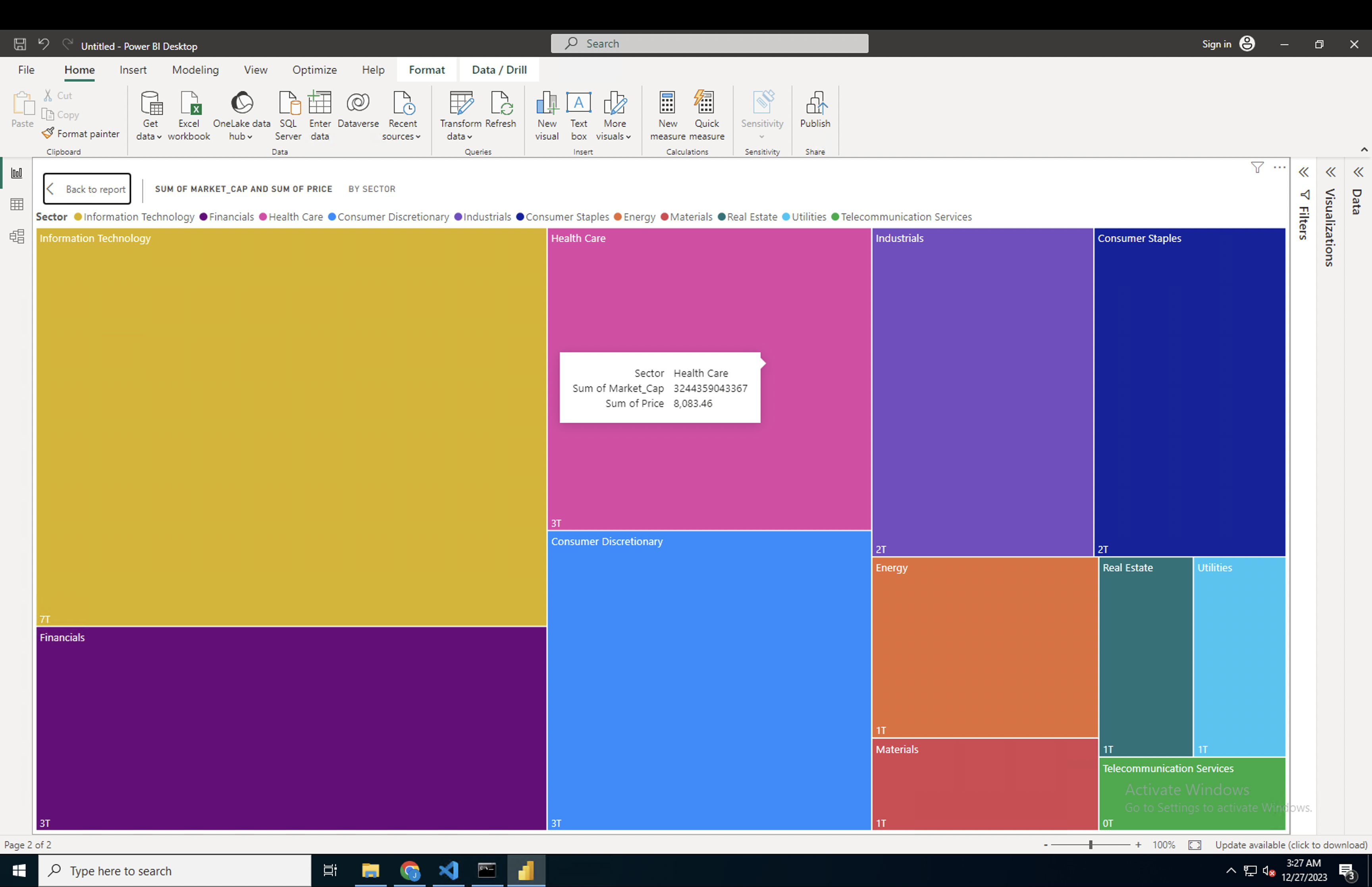
With a Treemap between Sector 그리고 Market_Cap. Each rectangle represents a sector, displaying market capitalization differences. Hover for specific sector prices.
Hurray! You can now extract real-time operational and visual insights using Couchbase Analytics on JSON data within Power BI.
요약
I hope you’re excited about this highly requested feature for effortlessly visualizing Couchbase Analytics with Power BI. Explore the resources below to kickstart your journey of transforming data into insights. We eagerly await your feedback on the Couchbase Forums.

댓글 남기기
댓글을 달기 위해서는 로그인해야합니다.